How will Google’s “Mobile Friendly” Website Affect Your Website
Each year Google has 3 – 5 major algorithm adjustments. This is an effort to level the playing field for all of us to be found online. It is not typical for Google to give us a heads up for an impending algorithm change. But the next one has the opportunity to significantly effect many businesses, especially those with a high volume of mobile traffic.
Many businesses have approached their web presence without a great deal of consideration to how much of their traffic is with a mobile device. With the growth of smart phones and tablets over the past few years, the time has come to wake up and get in the game. That is if you hope to still be found online with a mobile device.
On April 21, Google will begin rolling out a worldwide mobile-friendly algorithm update. This. update will have a “significant impact” on mobile search results for mobile searchers. In essence, if your e-commerce or business site does not pass Google’s mobile friendly test, there’s a real possibility that Google will send you fewer mobile search customers after April 21.
How will this effect your website?
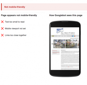
First step is to see if your website is in compliance. Will it benefit from the new mobile-friendly algorithm update?
 A negative test result means that sites that you are competing with that have mobile-friendly websites will benefit. Ranking higher than any site that is not mobile-friendly. Bad news for sites that are not developed or have not been updated to be “Responsive”.
Google is calling the update “significant,” which is a big deal for Google. Again the fact that Google is talking about this publicly should cause all businesses and anyone else with a web presence to take notice. Connect with their Greenville or Spartanburg web developer to make the needed changes for their website to become responsive or mobile-friendly.
It is hard to tell exactly how significantly this will impact your business. Are you aware of how much of your website traffic is visited by a mobile or tablet device?
It is not expected to directly impact searches conducted on desktop or laptop computers, because of screen size.
Your keywords and phrases and branding will remain to be a strong factor in all searches.
We all know the answer to one of our Swift staple questions. “How many first impressions do you get?” A web presence continues to be for most businesses their first impression, this will only increase as time goes on.
Website Traffic
If you have a significant of amount of traffic, 15% or more, taking steps now will allow you to experience the benefits that will come by having a mobile-friendly website. Your competition might choose to wait. This will give you an edge online to come in contact with their clients as they begin to slip down the rankings. This is because of their failure to take this update seriously.
Having a responsive website will allow visitors to have a richer more in depth experience with their mobile device. Ultimately allowing them to want to stay longer and review more content.
 Greg Weinstein is the Director of Swift Business Solutions. He has worked with hundreds of professionals on their business while they are busy working in their business. Email Greg


2 comments
Comments are closed.